Best Practice: Ensure that your site is professionally designed, it clearly communicates who you are, and shows how your firm can help your target audience.
When selecting the right design or theme for your law firm website, understand that your prospective client’s first impression may determine right off the bat if they want to do business with you.
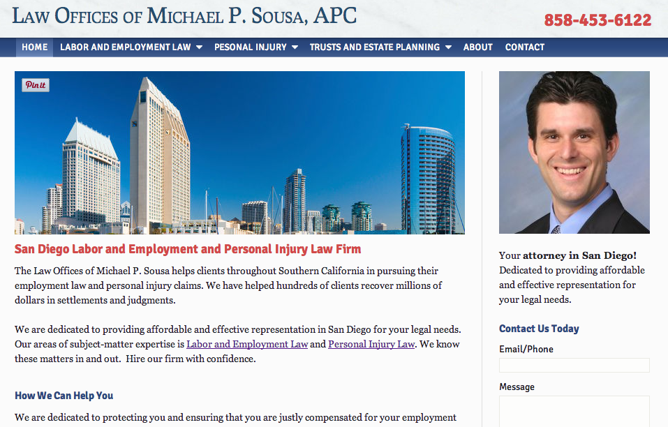
In the Labor and Employment Law Firm example above, there are 3 major points that help improve the website’s first impressions for new visitors.
And they are:
- A professional design that is clearly organized to enhance user-experience.
- The site communicates to its visitors exactly what it’s about immediately.
- The site tells it’s visitors exactly how it can benefit them immediately.
At a quick glance, there’s a lot of information that is communicated based on the website’s design alone.
- We immediately know who we will be working with.
- We immediately know how to contact the law firm.
- Nothing on the site distracts us from our mission at-hand to find an attorney. That means, there are no over-the-top moving sliders, auto-play videos, flashing text, etc.
In RED text above, it clearly tells us that the online property is about a San Diego labor and employment and personal injury law firm. It literally took less than 2 seconds to identify this.
Right below that, a highlighted and separate section called “How We Can Help You” explains exactly how prospective clients can benefit from this law firm.
So within 8 seconds or less, new visitors can immediately sort themselves out whether or not they need the services that this law firm provides.
Go to the Law Offices of Michael P. Sousa to see the full law firm website.

